Decor Tips
12 Spring Color Palettes That Are A Breath of Fresh Air
When it comes to the change of the seasons, we love an “out with the old, in with the new” approach. Spring is an especially exciting time, when we get to shed our layers and swap the dark and cold for the light and bright. We’ve found one of the best ways to usher in this period is with a brand new spring color scheme.
You may be asking, “what are spring colors?” and we prefer to challenge the notion that spring color combinations must encompass pastels. On the contrary, there are plenty of ways to break the mold of the typical spring color palette, and we’re here to introduce you to 12 new and unique ideas that are still fresh and rejuvenating, but perhaps a little more sophisticated and elevated.
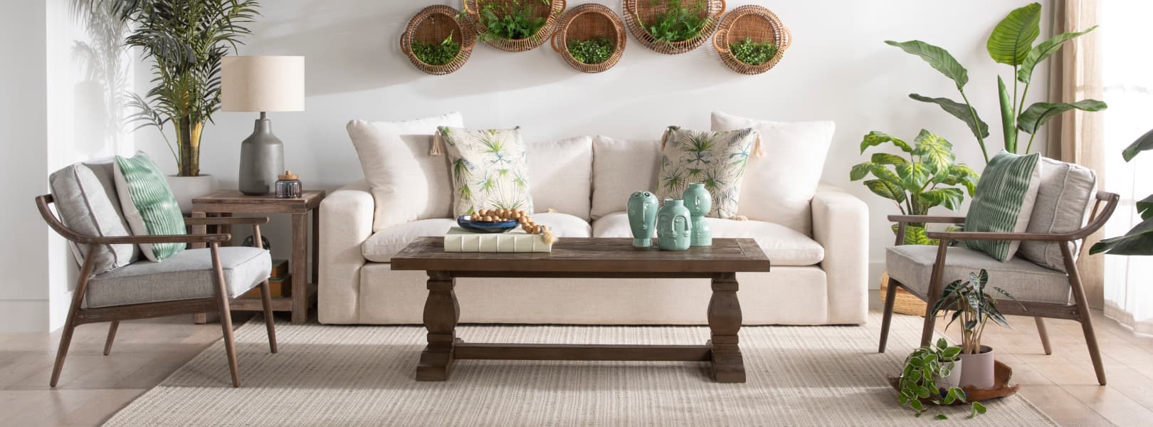
The best colors to evoke the spring season are typically a combination of a light and a bright, which makes cream and green one of the most compelling combos. You can think of both as foundational hues that go with just about anything in the spring color spectrum. While green is energizing, white offers that balance of peace and relaxation.
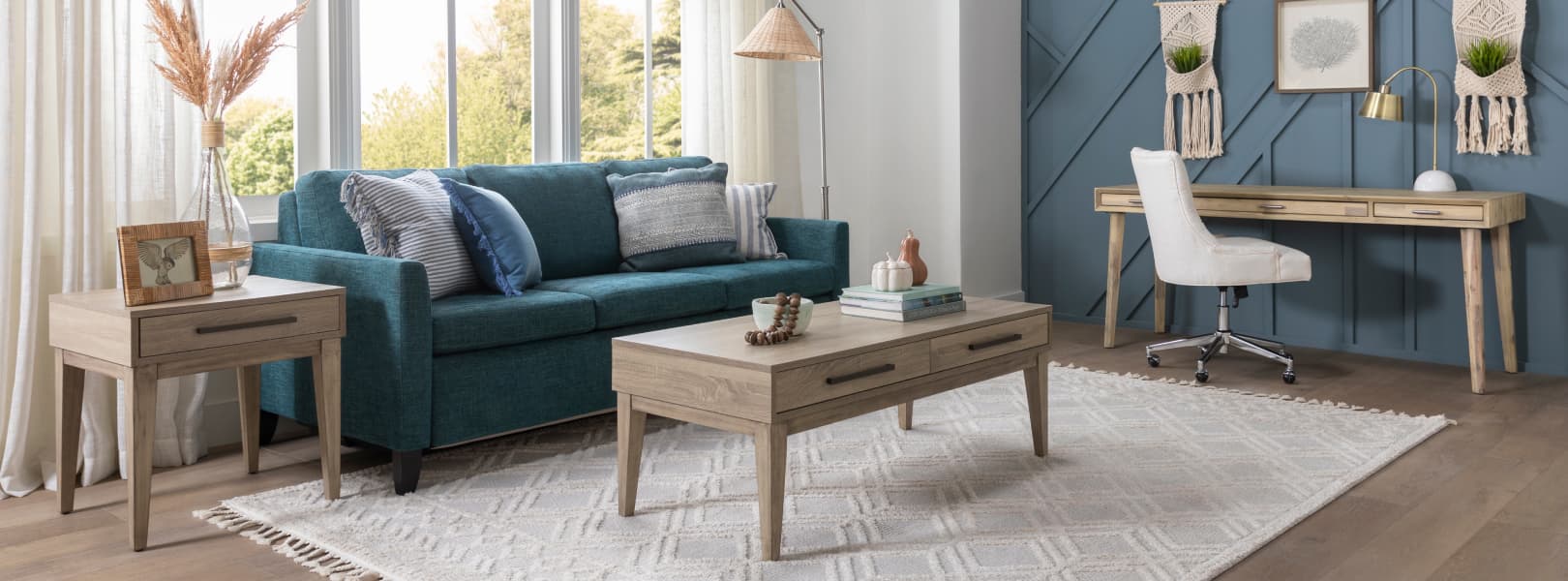
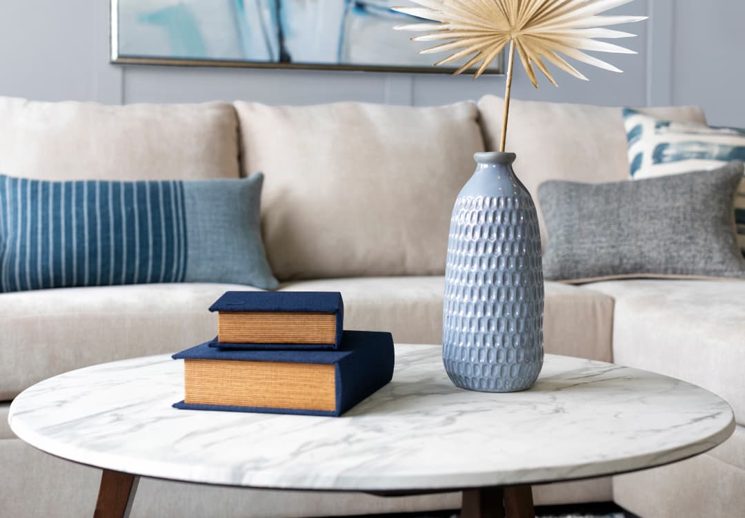
As far as color trends go, there’s one hue that is a consistent headliner - blue. And when you mix shades of it together - like teal and dusty blue - you’re in for a treat. There’s so many popular versions of blue, from robin’s egg to cornflower, and you can enjoy its calming qualities in a spring palette that’s on the cooler side. A living room that incorporates blue as a paint color allows you to enjoy it on a grand scale and let its tranquility wash over you.
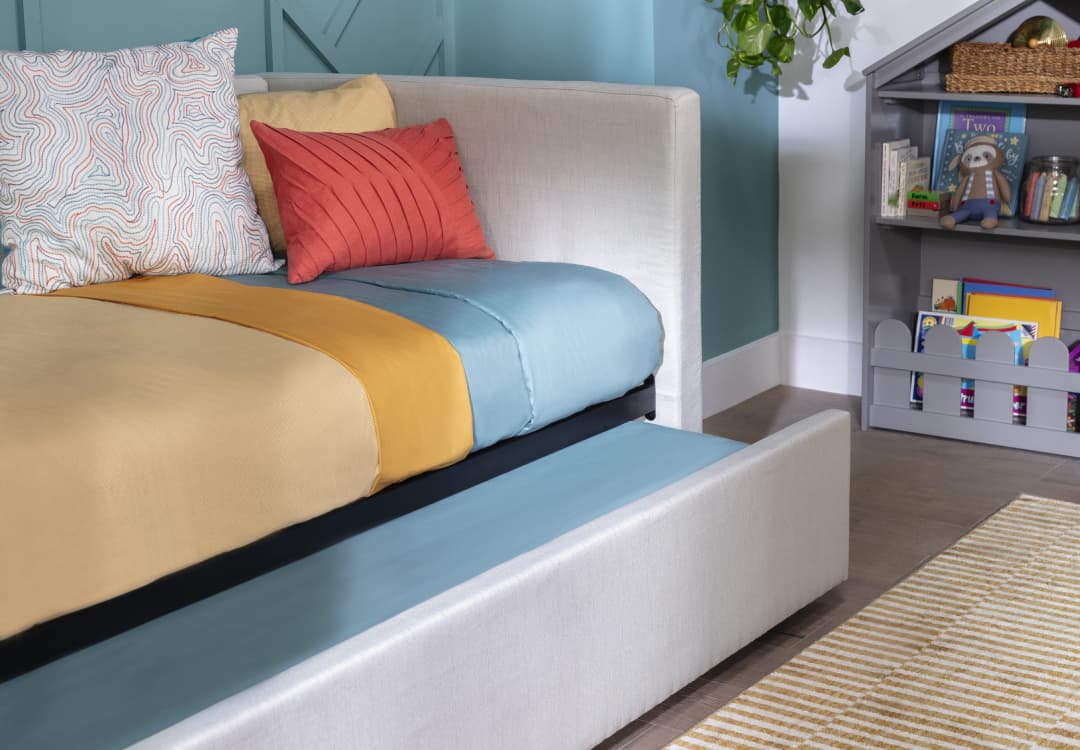
With color inspiration that draws from a bright spring palette, this combo is as happy as can be. By pairing multiple hues from the color wheel, it achieves maximum positivity. Whether they come in splashes or sprinkles, the bright colors are a playful bunch that work particularly perfectly in kids’ spaces, where imaginations run wild. It’s impossible to feel anything but jubilant when you’re in an environment this fun.
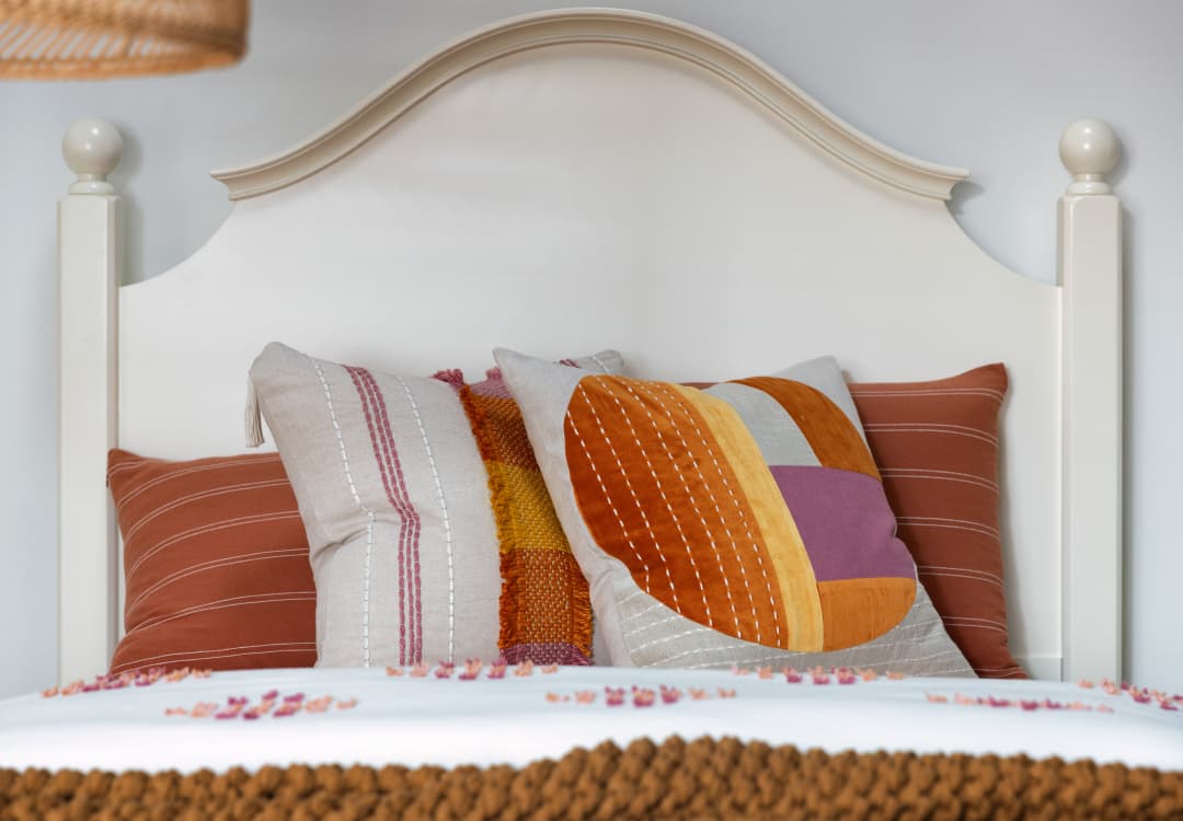
Whether it’s different takes on an orange color - including rust and terra cotta - or pops of yellow and purple - this color palette embodies that of a warm spring sunset. This beautiful color chorus sings a joyful tune that can bring an entire space to life, which is especially handy in waking up a bedroom. By adding lilac and bubblegum undertones, you could create a true spring haven.
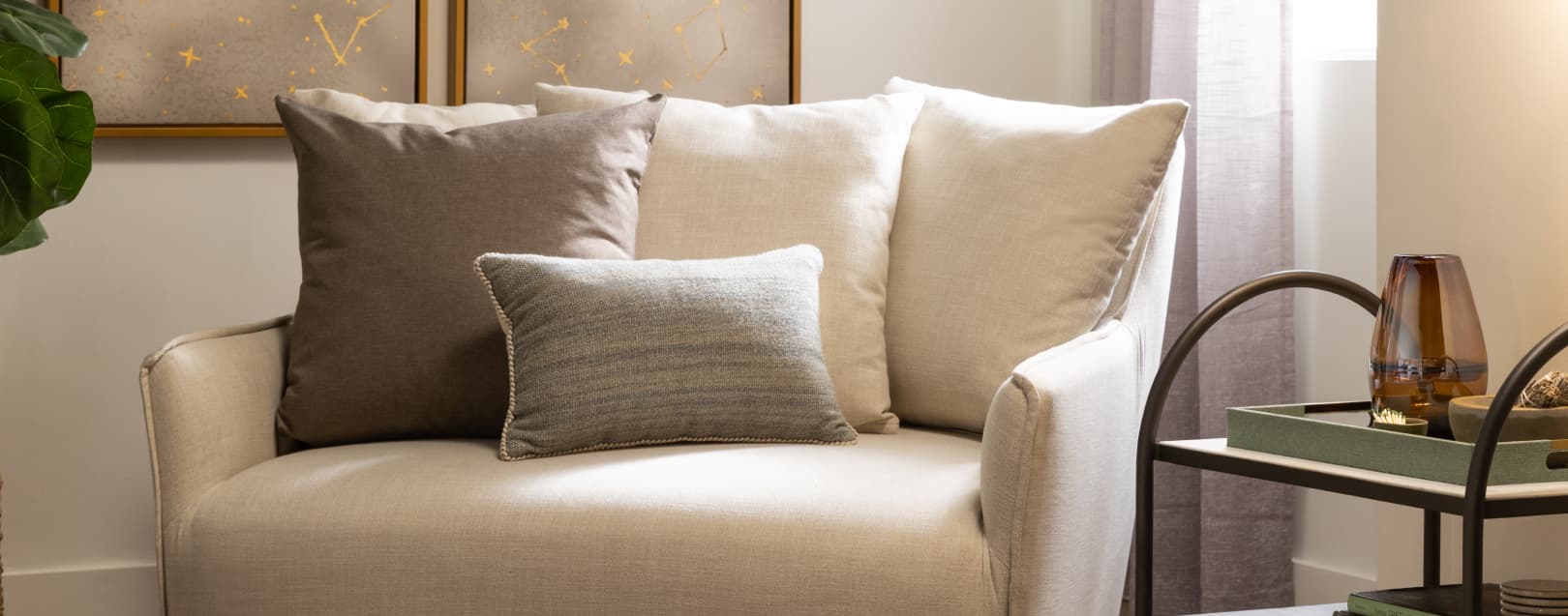
If you were to do a seasonal color analysis, you’d likely find pastels at the top of most spring color schemes, which means our list wouldn’t be complete without at least one. Together, blush and beige create a floral-inspired pair that channels the beauty of tulips or cherry blossoms. You can let this combo bloom in any room and use soft textures to apply a light spring touch.
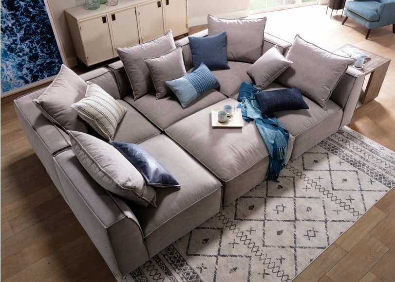
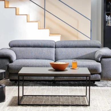
While this combo may not be your typical spring pair, we believe seasonal color palettes can be broad enough to include hues we use in interior design throughout the year. Grey lays a neutral foundation that plays well with others, especially blue. The two form a tranquil pair that bring ease and serenity to any room.
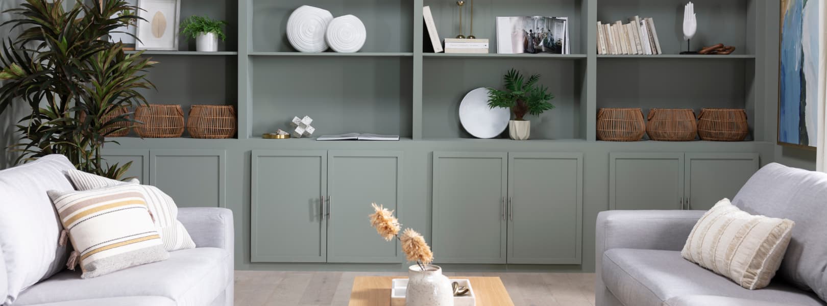
As we go down the list, we’ve been learning that spring isn’t all about bright colors or pastels, and this pair proves it with the combination of a muted sage green and grey. While both are on the softer side, they still maintain a refreshing presence that lends itself well to the season. With sage as the dominant color, you can establish a more traditional spring look.
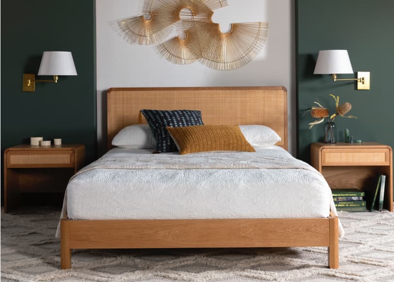
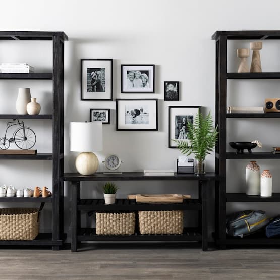
Visions of spring typically involve natural landscapes, which is why the combination of a golden brown and dark green work so perfectly to evoke the spirit of the season. You can’t help but feel swept away and taken from the inside out with these hues that appear to be copy and pasted from a forest. The warm tones of the wood emit a sense of coziness that’s complemented by the enveloping green.
There are few color combos as timeless and classic as blue and white, which makes this pair a perennial favorite. Whether it’s used as a winter, fall, spring or summer color palette, the two offer a sense of casual elegance. There’s also an undercurrent of coastal inspiration that lends itself well to spring vacation at the beach vibes.
10 | Green and Pink
Spring and florals are a match made in heaven, just like green and pink. Inspired by the Pantone color of the year - magenta - we’ve lightened things up for the season to bring a softer touch and paired it with a spring-fresh green that brings the outside in. Not only does this combo work well in interiors, it’s one of the most delightful spring wedding color palettes.
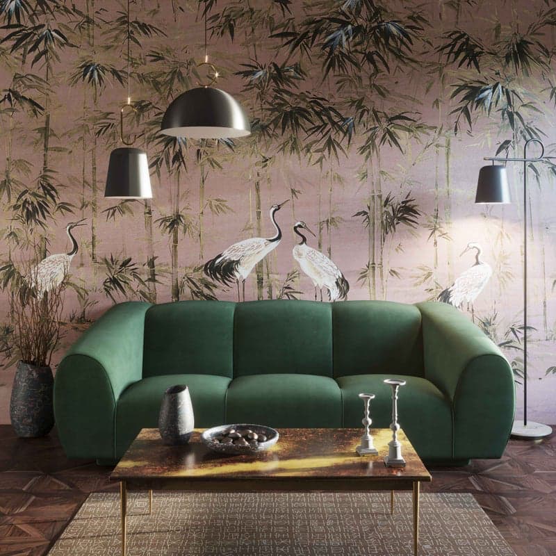
11 | Gold and Emerald
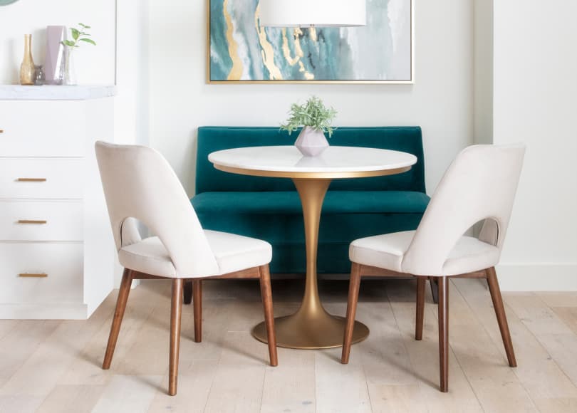
We’re taking things in a glam direction by pairing a jewel-toned green with a warm metallic. Together, gold and emerald feel fashionable and luxe for spring. They represent an elevated take on your typical spring palette, but still resonate and ring true to the nature of the season. Completely dreamy in a dining nook, the pair would also work well in a cozy high-end bedroom retreat.
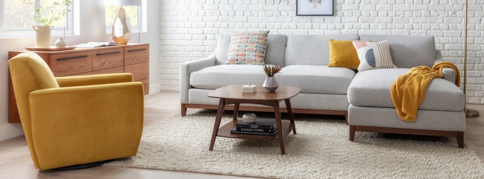
12 | Grey and Mustard
Having both appeared on the list already, it was only a matter of time before we paired grey and yellow together as the last but not least spring color palette idea. When you combine the bright and sunny nature of mustard yellow with the casually sophisticated light grey, there’s a striking contrast that happens, and we’re here for it.
— More Great Articles —
Read the Latest
Editorial Disclaimer: Articles featuring tips and advice are intended for educational purposes and only as general recommendations. Always practice personal discretion when using and caring for furniture, decor and related items.