Ideas + Advice

Decor Tips

A Guide to Winter Color Palettes

As soon as autumn ends and the transition to winter begins, it’s hard not to get swept up by the spirit of the winter season. While many of us associate a winter color palette with the holidays, the truth is that the season lasts way past the parties and revelry. According to our very scientific seasonal color analysis, the popular color schemes and color combinations for winter are ironically taking a page out of the autumn color book and even steal from the cool summer swatches.

While you may not find many pastels, you will discover a high contrast level in some of the couples. Pairing dark with light is a prominent theme, as is using neutrals to soothe and provide a sense of cozy comfort. We think you’ll agree that each palette celebrates the magic of winter in a unique and authentic way and will help your home feel like the true winter refuge it is.

White and Metallics
Thinking about winter will inevitably conjure visions of snow, so white is an obvious choice for a crystal clear winter palette. By mixing it with metallics, you instantly elevate the look to a level of casual glamour. Whether you prefer silvery tones or warm golden hues, you can create an enchanted environment as you pair a light, airy white and a glowing metallic. This combo works especially well with white as the star and your metallic cast as the supporting ensemble.

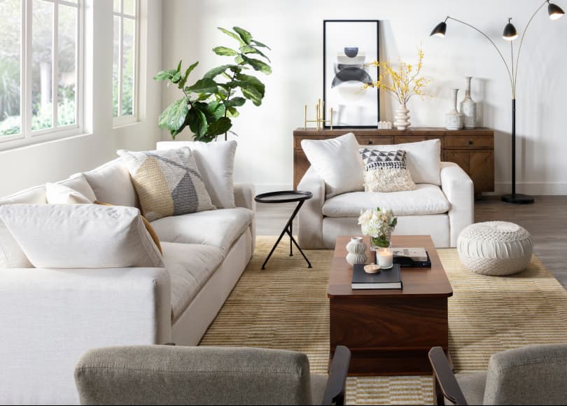
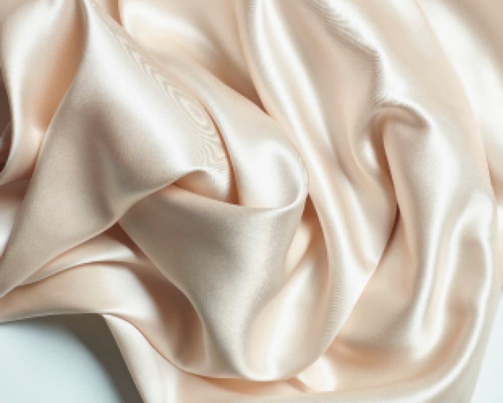
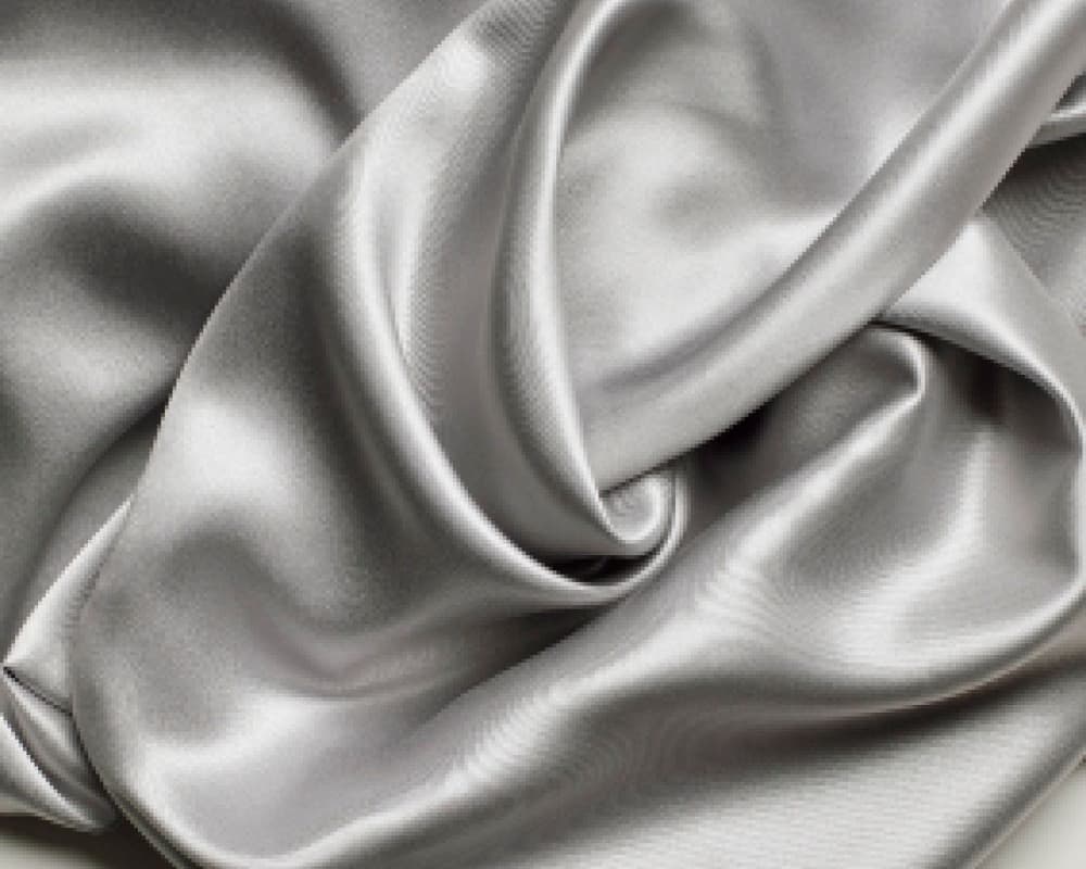
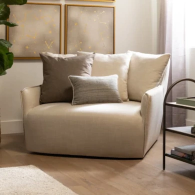
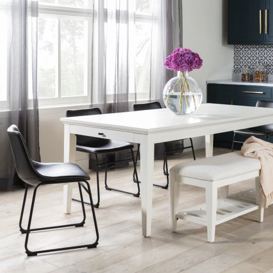
White + Metallics Winter Color Palette Inspiration

Warm Wood and Dark Grey
While some of us consider lighter winter wonderland colors to be the norm for a winter palette, moodier dark colors with blue undertones also have the power to channel the season’s curl up and calm down vibes. Think of rainy days when the clouds are an ashy grey. We especially love pairing the warm tones of wood - whether dark brown or medium brown - with a dark grey. Together, the couple has an enriching effect that we love for an atmosphere that makes you feel safe and secure in your homebody skin.

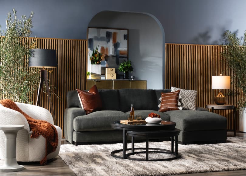
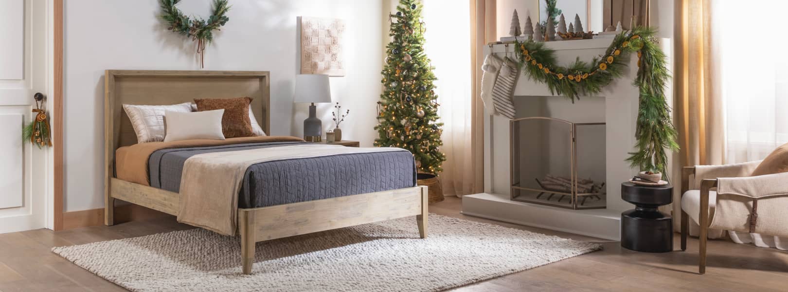
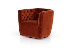
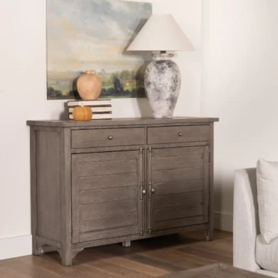
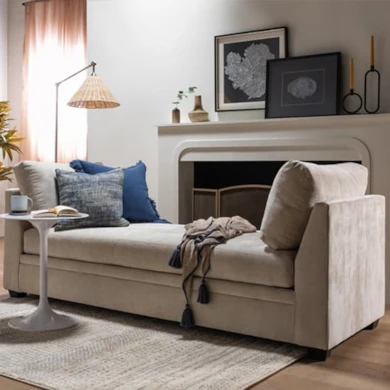
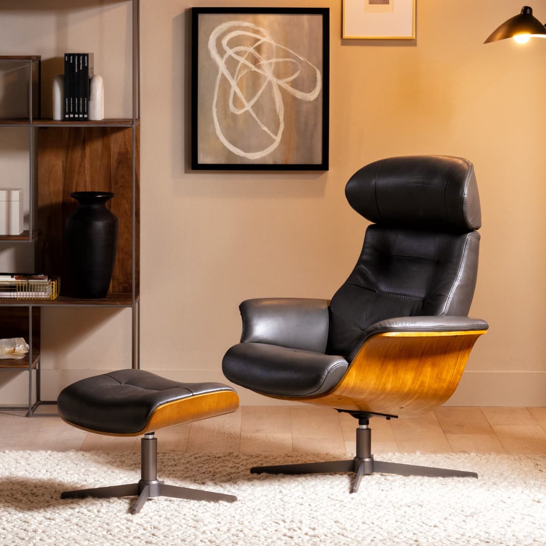
Warm Wood + Dark Grey Winter Color Palette Inspiration

red and neutrals
Red and Neutrals
If autumn has yet to leave the building, then we have a winter palette of warm colors that still relishes the romance of fall. While bright colors are not the vibe, we do believe there’s potential in mixing red with neutrals. The pop of deep autumn that comes in with a maroon or wine-soaked burgundy hue works especially well with browns, beiges and creams. This potent combination is a breath of fresh air in the winter palette conversation, and we think you’ll love its unpredictable nature.

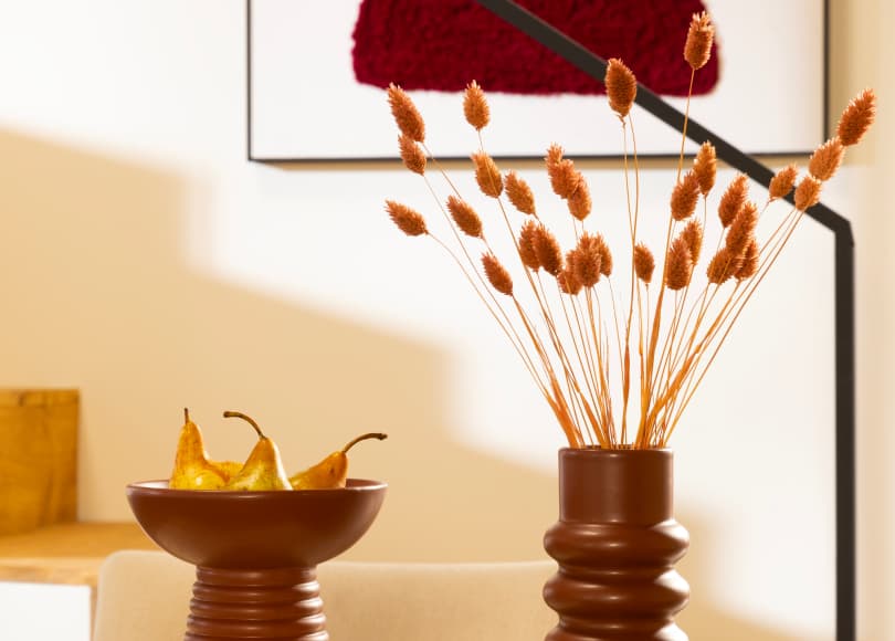
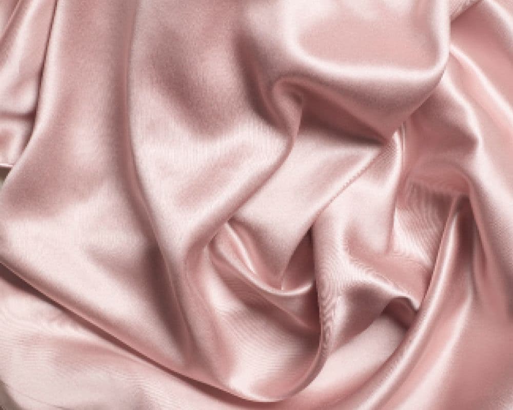
Red + Neutrals Winter Color Palette Inspiration

white and blue
White and Blue
One of those high contrast color combinations that can be used through the year, we love white and blue for a cool winter. After all, using cool blue and cool undertones speaks to the icy and frosty nature of the season, but you can also incorporate bright blue for an unexpected splash of color. If you love blue, it’s easy to add different shades to create a wintery scene.

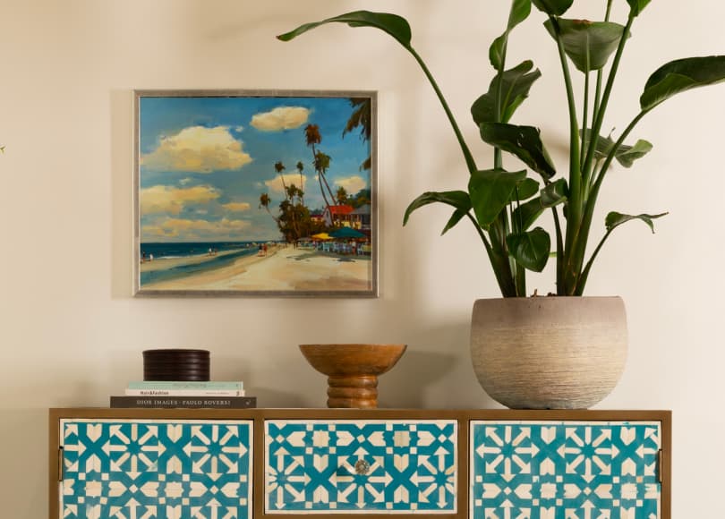
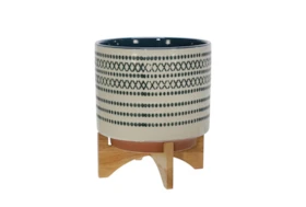
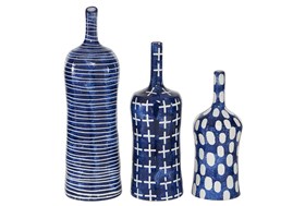
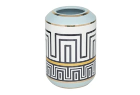
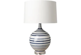
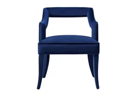
Blue + White Winter Color Palette Inspiration

Jewel Tones
Whether you want to experience a bright winter, dark winter or deep winter, you can achieve the vibe through romantic jewel tones that come in all shades. Creating an enchanting environment is as easy as adding emerald green, dark purple or dark blue to your room, as all of these hues are radiant and glow with possibility. When you use this palette, it’s like putting on a perennial party in your space.

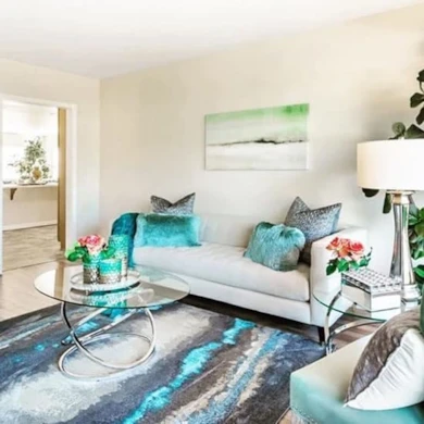
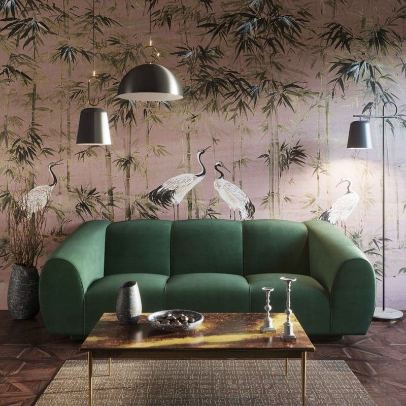
Jewel Tones Winter Color Palette Inspiration

Read the Latest

Editorial Disclaimer: Articles featuring tips and advice are intended for educational purposes and only as general recommendations. Always practice personal discretion when using and caring for furniture, decor and related items.